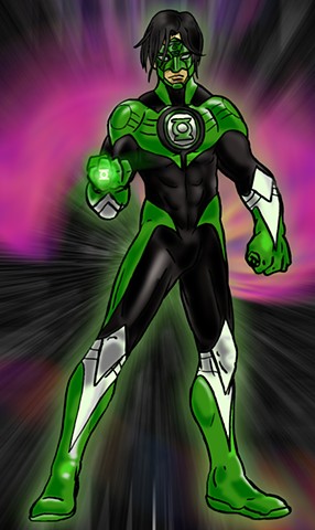
Character Designs
Project Rooftop, for those unaware of its existence, is a website where various artists submit works that consist of costume redesigns for various superheroes from all comic book universes. Submission is pretty open, as long as you link to your creative website/digital portfolio and that the work is of an original design. Occasionally, the run design contests that are judged by panel and NOT by popular vote. The reason I emphasis that point is from my own disasterous experience participating in a digital pirtfolio site,Talenthouse, and their Create A Superhero contest, that resulted in basically established artists blowing everyone else out of the water and people with shareware creating superheroes from templates that get more votes than struggling artists. See any similarities to the current Kickstarter debate?
Anyway, Project Rooftop announced a Green Lantern Redesign contest that was being judged by a commitee, with one of judges being Ron Marz. Ron Marz is a comic writer who does a lot of work for Top Cow, but I most remember him for introducing and writing one of my favorite GL comic characters, Kyle Rayner, a freelance artist who became the ONLY Green Lantern for a spell after Hal Jordan's fall. Kyle has remained a consistent member of the "Earth GL" group and most recently, harnessed all the different colors of the Emotional Spectrum to become a White Lantern (this represents Life in the comic canon)
As a fan of the Green Lantern series, I wanted to participate in this contest so I went about brainstorming ideas for a newly designed Green Lantern. For this rendition, I went with Kyle Rayner for my submission and went to figure out how to redesign his uniform. I started by playing up his artistic and manga influenced roots while adhereing to the design elements that made the GL costume such a classic. So, I based his costume design on Ultraman, who uses a mixture of curved and angular elements to their costumes for Kyle's design. I used white for the knee and elbow elements to add a separation of the green and black, as I do feel the white helps compliment the colors when done right. For the mask, I simplified his classic "Crab Mask" look for a more streamlined design as I seen from various artists always deliver mixed results in drawing that mask. So, I went and made it easier to draw the mask, while connecting it to the suit, again, to adhere to my Ultraman suit design.
After drawing the picture, I inked with with a brush pen and colored it in Photoshop. The glowing emblem is actually a piece I designed in Illustrator that I rendered in Photoshop. The Body aura comes from me taking the base body color, changing it to green, glowing it via filters, then blurring it and adjusting the opacity for the final effect.
